
Case study
Mercer Mass Timber
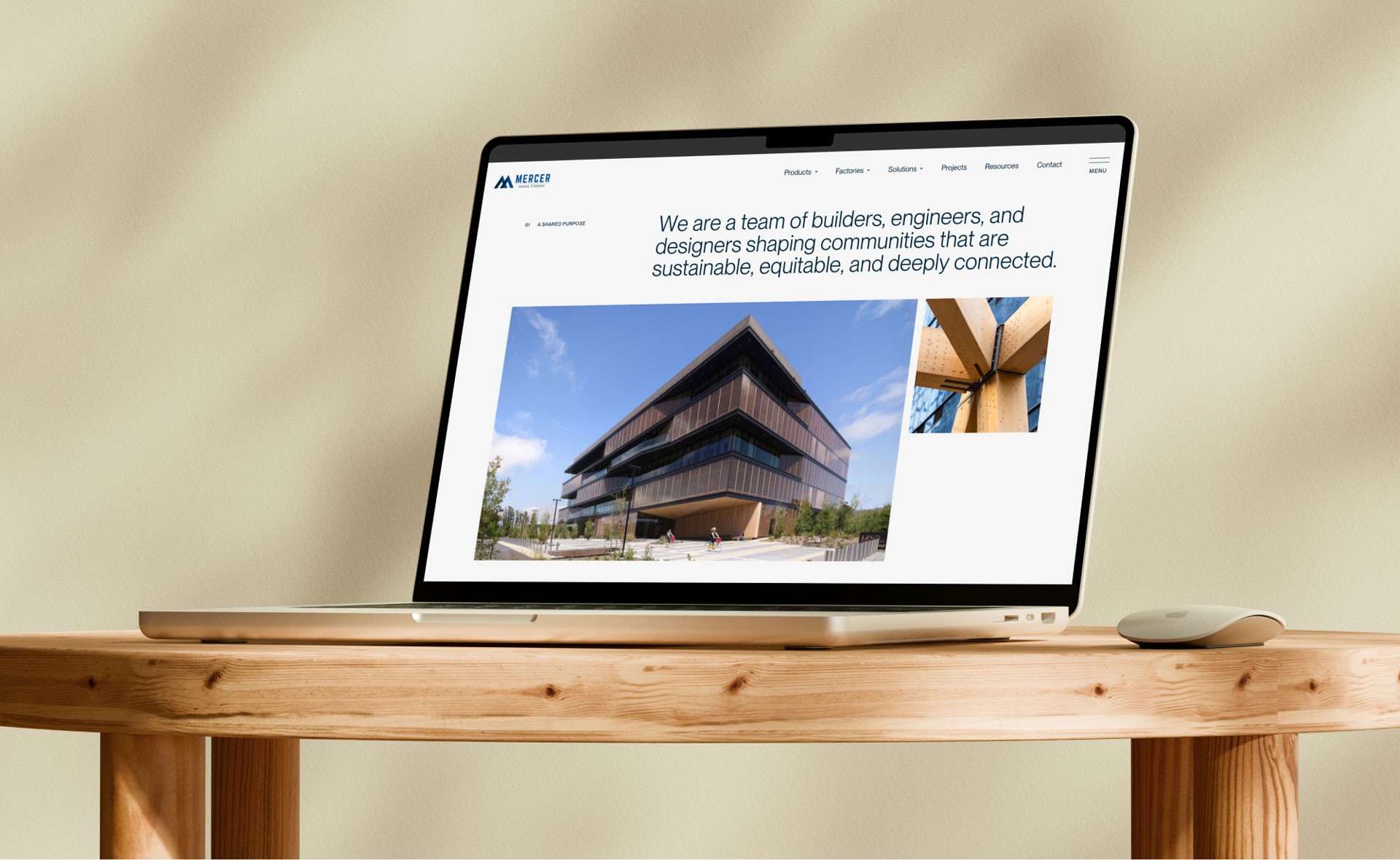
Website design & development — multi-phase partnership

A three-year partnership building a brand and digital platform for a technical industry. From a single page to a comprehensive, award-ready digital experience.
Visit live site
Role
UX, UI Design, Development, Illustration, Creative Team Lead
Duration
3 years (2022 to 2025)
Platform
WordPress, Elementor, GSAP

01 – Overview
A startup within a corporation
A highly technical product, multiple audiences, and a website that needed to evolve alongside the business.
Mercer Mass Timber needed a digital presence that could stand on its own; treated like a startup with a distinct identity, while still clearly connected to its parent company, Mercer International. The goal was to elevate the brand to feel premium, approachable, and positioning MMT not just as a manufacturer, but as a leader and educator within the mass timber industry.
02 – The Challenge
A technical product for a fragmented audience
Mass timber is a specialized, highly technical product. The design challenge was really a communication challenge.
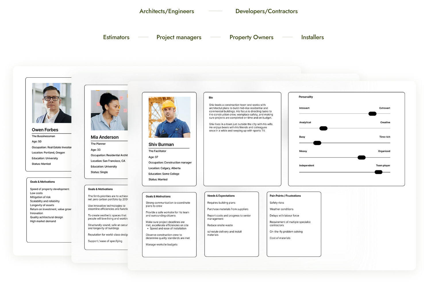
MMT's audience breaks into two main groups: architects and structural engineers who need deep technical specs, and developers and contractors evaluating feasibility and cost. On top of that, a secondary layer of estimators, project managers, property owners, and installers all come to the site with their own questions and their own level of technical knowledge.
The site needed to serve all of them without losing any of them while positioning MMT not just as a manufacturer, but as an educator and thought leader in a growing industry.
There was also a practical constraint: the platform needed to be easy enough for a non-technical internal marketing team to update. So every solution had to balance design ambition with real-world accessibility.
User Personas
03 – My Role
Designer, developer, and creative director
Across all four phases I led strategy, UX, UI design, and WordPress development. On the larger phases I put together a small team of specialist collaborators and directed them throughout:
- Creative Director (Rav Lehk): brand identity, storyboarding, and augmented reality
- Copywriter: initial brand naming and starting web copy
- 3D Animator (Jan G Studio, UK): product animations and promotional video
I was responsible for scoping each phase, managing timelines, presenting work to stakeholders, and making the final call on design and technical decisions across every deliverable.
04 – Phase Breakdown
Four phases. Three years. One evolving platform.

Phase 1 — Foundation (2022)
The ask was a full brand identity, 3D animation, and website from scratch. I assembled a specialist team to deliver it: Rav Lehk at Goliath Creative for brand identity, a copywriter for naming and messaging, and Jan G Studio in the UK for 3D animation. I led the project, set the creative brief, and presented work to the client throughout.
Rav developed four distinct brand identity concepts, each rooted in a different narrative theme drawn from the nature and materiality of mass timber. Each included a logo system, colour palette, typography, and full brand application mockups.
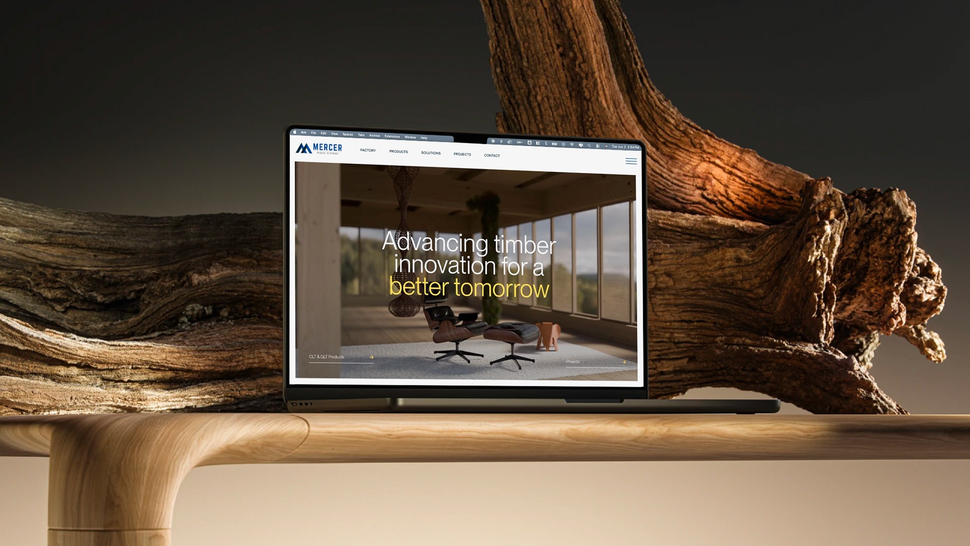
When the scope shifted: the parent company opted for a sub-brand approach rather than a standalone identity. We pivoted quickly and moved to launch a focused single-page site to get MMT online while the broader strategy evolved, with 3D animation to bring the product to life. The visual language established here carried through every phase after.
Phase 2 — Expansion (2023)
With the foundation in place, MMT was ready to build out the full site. This phase added products, solutions, factories, projects, resources, careers, and contact — and introduced a new scroll-based animation concept showing a mass timber building assembling piece by piece. I also created a library of custom branded illustrations used throughout the site.
Key decisions:
- Structured the IA so both technical and non-technical users could navigate to what they needed without friction
- Designed the scroll-based animation to make an abstract technical product tangible and memorable, something a spec sheet never could
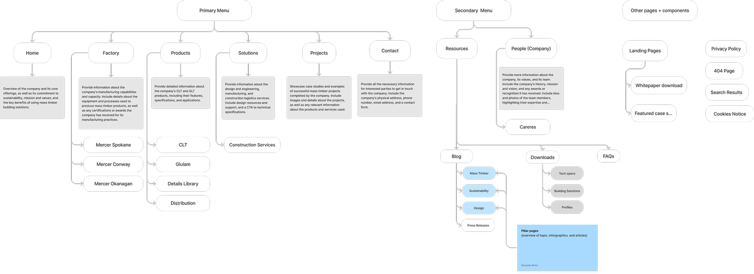
Sitemap & Information Architecture
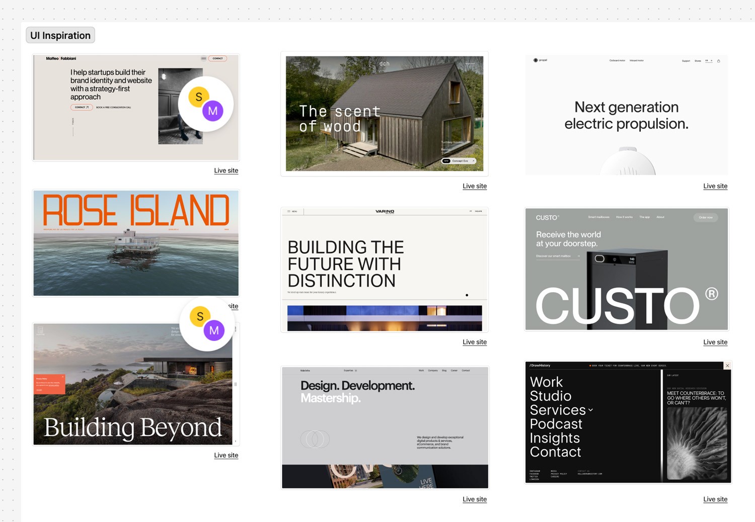
Inspiration & UI Moodboard
Illustrations & Animations
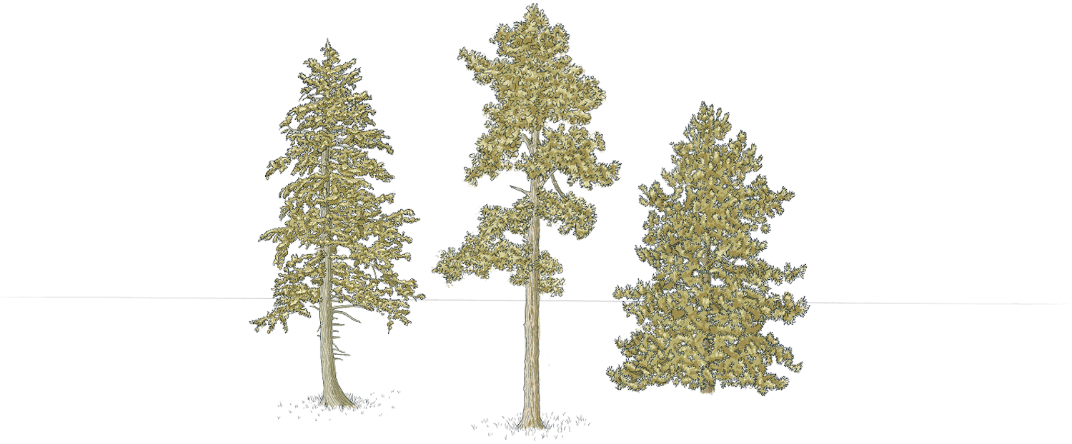
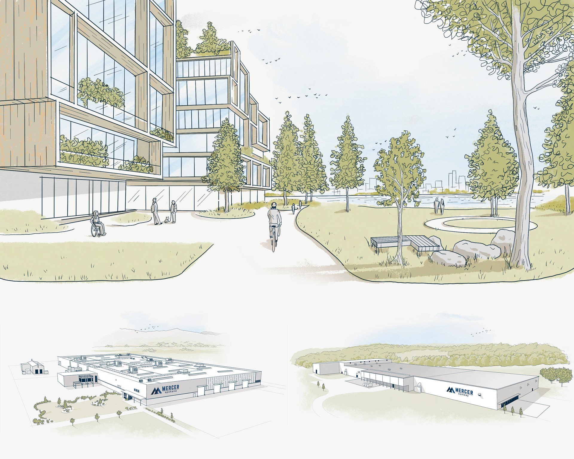
Created custom illustrations of factory exteriors, tree species, and scenes to build a distinctive visual identity rather than relying on stock assets.
I also created an interactive Holiday card that year: a pop-up storybook telling their origin story across four pages, where the user clicks to turn each page.
Phase 3 — Refinement (2024)
This phase focused on extending the brand beyond the website. MMT was growing their presence at industry conferences and needed AR experiences to use on-site. We produced four AR activations, a new hero promotional video for the website and marketing campaigns, and ten product component animations for the products page.
Key decisions:
- Storyboard and develop a short animated video to creatively showcase MMT’s product transforming into different visual representations - used for the website’s hero section
- Transform the Product page into a scroll-based narration to communicate the value of their products
- Extended the MMT brand into physical conference environments through AR, connecting the digital and in-person experience
- Used animation to communicate structural product components that are difficult to show through static imagery
I also created a second holiday interactive page: an illustrated skier going down a mountain, passing flags marking MMT's milestone achievements throughout the year. I was also asked to create 3 timelapse drawings for social media usage.
Phase 4 — Maturity (2025)
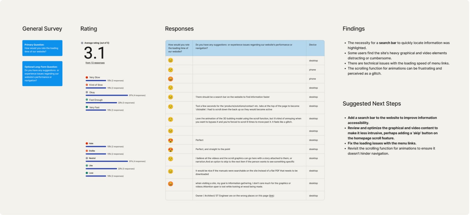
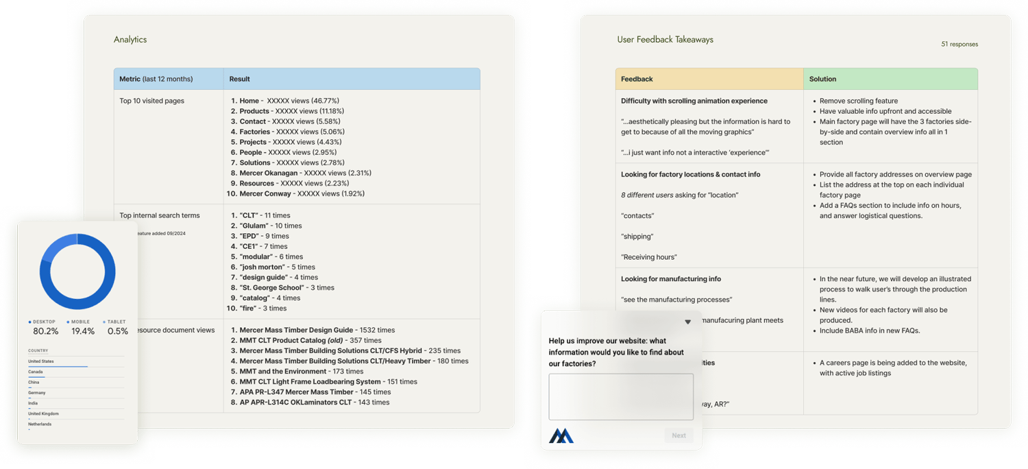
The goal for Phase 4 was to elevate the UX across the entire site, expand content, and build something award-worthy. Before any design work started, I ran a proper UX audit.
Research Process
- Deployed on-page surveys to gather direct user feedback
- Analyzed GA4 data and Hotjar heatmaps and session recordings to find drop-off points and friction
- Hosted a workshop with MMT's internal engineers and sales team to surface gaps from the people closest to their customers
- Defined audience segments and their intentions
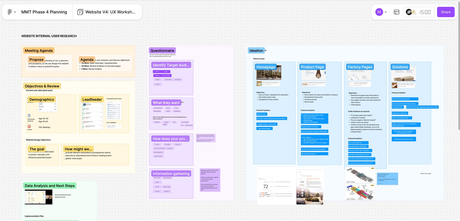
UI Improvements
- Subtle scroll-triggered micro-animations across all pages
- Mega menu redesign to handle the growing content structure
- New product diagrams with dynamic technical specs for CLT and Glulam product lines
- Four new sub-pages: Details Library, Distribution, Construction Services, and a new factory page
- A Factory Safety Orientation page with custom illustrations and an interactive quiz
- Updated Resources section with individual document pages and an embedded PDF viewer
- A custom species map illustration showing North American wood sourcing
- An LOD process illustration sequence tied to a scroll animation
- Three new 3D product animations from Jan G Studio
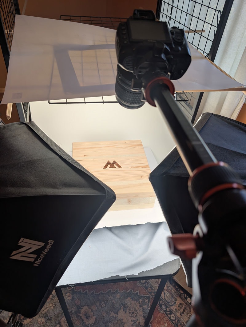
- 360 degree interactive product photography
360 Photography
The 360 photography is worth a mention on its own. I wanted to let users interact with physical wood samples on screen — spinning them to see grain, texture, and species mixes. I built my own setup: a motorized remote turntable, studio lighting, and a tripod. I shot hundreds of frames per product, edited them, and processed them through WebRotate 360 software. It was painstaking but the result is something I have not seen on any other mass timber website.
05 – Outcome
A platform that grew with the business
Phase 4's UX-focused redesign delivered clear results:
- Bounce rate dropped 22%, meaning significantly more users were staying and exploring past the first page
- Average session time decreased 18%, users were finding what they needed faster, a direct outcome of the restructured navigation and IA
The result I am most proud of is the relationship itself. What started as a single project grew into three years of ongoing work; the clearest sign that the work was consistently doing its job.
Client Voice
"From the ground up, Myranda was instrumental in defining how Mercer Mass Timber showed up in the world. Her work translated a complex, technical industry into an inspired digital experience that reflects who we are: precise, modern, and innovators of our craft. Her work elevated our brand beyond industry norms and positioned MMT as a leader with a differentiated presence."
— Shel Tejamo, Marketing Director, Mercer Mass Timber
Thanks for reading
Check out the rest of my portfolio.
Go to portfolio
Case study
Mercer Mass Timber
Website design & development — multi-phase partnership
A three-year partnership building a brand and digital platform for a technical industry. From a single page to a comprehensive, award-ready digital experience.
Visit live site
Role
UX, UI Design, Development, Illustration, Creative Team Lead
Duration
3 years (2022 to 2025)
Platform
WordPress, Elementor, GSAP
01 – Overview
A startup within a corporation
A highly technical product, multiple audiences, and a website that needed to evolve alongside the business.
Mercer Mass Timber needed a digital presence that could stand on its own; treated like a startup with a distinct identity, while still clearly connected to its parent company, Mercer International. The goal was to elevate the brand to feel premium, approachable, and positioning MMT not just as a manufacturer, but as a leader and educator within the mass timber industry.
02 – The Challenge
A technical product for a fragmented audience
Mass timber is a specialized, highly technical product. The design challenge was really a communication challenge.
MMT's audience breaks into two main groups: architects and structural engineers who need deep technical specs, and developers and contractors evaluating feasibility and cost. On top of that, a secondary layer of estimators, project managers, property owners, and installers all come to the site with their own questions and their own level of technical knowledge.
The site needed to serve all of them without losing any of them while positioning MMT not just as a manufacturer, but as an educator and thought leader in a growing industry.
There was also a practical constraint: the platform needed to be easy enough for a non-technical internal marketing team to update. So every solution had to balance design ambition with real-world accessibility.
User Personas
03 – My Role
Designer, developer, and creative director
Across all four phases I led strategy, UX, UI design, and WordPress development. On the larger phases I put together a small team of specialist collaborators and directed them throughout:
- Creative Director (Rav Lehk): brand identity, storyboarding, and augmented reality
- Copywriter: initial brand naming and starting web copy
- 3D Animator (Jan G Studio, UK): product animations and promotional video
I was responsible for scoping each phase, managing timelines, presenting work to stakeholders, and making the final call on design and technical decisions across every deliverable.
04 – Phase Breakdown
Four phases. Three years. One evolving platform.
Phase 1 — Foundation (2022)
The ask was a full brand identity, 3D animation, and website from scratch. I assembled a specialist team to deliver it: Rav Lehk at Goliath Creative for brand identity, a copywriter for naming and messaging, and Jan G Studio in the UK for 3D animation. I led the project, set the creative brief, and presented work to the client throughout.
Rav developed four distinct brand identity concepts, each rooted in a different narrative theme drawn from the nature and materiality of mass timber. Each included a logo system, colour palette, typography, and full brand application mockups.
When the scope shifted: the parent company opted for a sub-brand approach rather than a standalone identity. We pivoted quickly and moved to launch a focused single-page site to get MMT online while the broader strategy evolved, with 3D animation to bring the product to life. The visual language established here carried through every phase after.
Phase 2 — Expansion (2023)
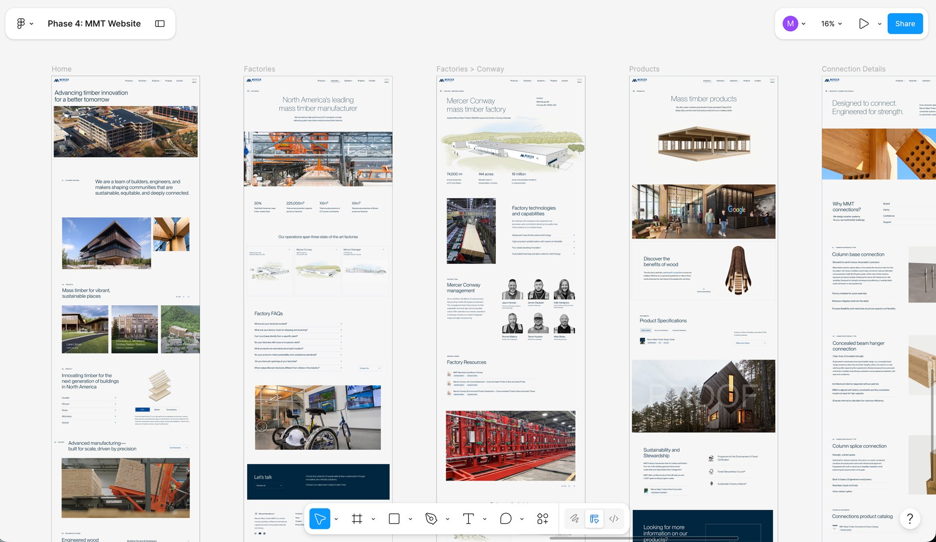
With the foundation in place, MMT was ready to build out the full site. This phase added products, solutions, factories, projects, resources, careers, and contact — and introduced a new scroll-based animation concept showing a mass timber building assembling piece by piece. I also created a library of custom branded illustrations used throughout the site.
Key decisions:
- Structured the IA so both technical and non-technical users could navigate to what they needed without friction
- Designed the scroll-based animation to make an abstract technical product tangible and memorable, something a spec sheet never could
Sitemap & Information Architecture
Inspiration & UI Moodboard
Illustrations & Animations
Created custom illustrations of factory exteriors, tree species, and scenes to build a distinctive visual identity rather than relying on stock assets.
I also created an interactive Holiday card that year: a pop-up storybook telling their origin story across four pages, where the user clicks to turn each page.
Phase 3 — Refinement (2024)
This phase focused on extending the brand beyond the website. MMT was growing their presence at industry conferences and needed AR experiences to use on-site. We produced four AR activations, a new hero promotional video for the website and marketing campaigns, and ten product component animations for the products page.
Key decisions:
- Storyboard and develop a short animated video to creatively showcase MMT’s product transforming into different visual representations - used for the website’s hero section
- Transform the Product page into a scroll-based narration to communicate the value of their products
- Extended the MMT brand into physical conference environments through AR, connecting the digital and in-person experience
- Used animation to communicate structural product components that are difficult to show through static imagery
I also created a second holiday interactive page: an illustrated skier going down a mountain, passing flags marking MMT's milestone achievements throughout the year. I was also asked to create 3 timelapse drawings for social media usage.
Phase 4 — Maturity (2025)
The goal for Phase 4 was to elevate the UX across the entire site, expand content, and build something award-worthy. Before any design work started, I ran a proper UX audit.
Research Process
- Deployed on-page surveys to gather direct user feedback
- Analyzed GA4 data and Hotjar heatmaps and session recordings to find drop-off points and friction
- Hosted a workshop with MMT's internal engineers and sales team to surface gaps from the people closest to their customers
- Defined audience segments and their intentions
UI Improvements
- Subtle scroll-triggered micro-animations across all pages
- Mega menu redesign to handle the growing content structure
- New product diagrams with dynamic technical specs for CLT and Glulam product lines
- Four new sub-pages: Details Library, Distribution, Construction Services, and a new factory page
- A Factory Safety Orientation page with custom illustrations and an interactive quiz
- Updated Resources section with individual document pages and an embedded PDF viewer
- A custom species map illustration showing North American wood sourcing
- An LOD process illustration sequence tied to a scroll animation
- Three new 3D product animations from Jan G Studio
- 360 degree interactive product photography
360 Photography
The 360 photography is worth a mention on its own. I wanted to let users interact with physical wood samples on screen — spinning them to see grain, texture, and species mixes. I built my own setup: a motorized remote turntable, studio lighting, and a tripod. I shot hundreds of frames per product, edited them, and processed them through WebRotate 360 software. It was painstaking but the result is something I have not seen on any other mass timber website.
05 – Outcome
A platform that grew with the business
Phase 4's UX-focused redesign delivered clear results:
- Bounce rate dropped 22%, meaning significantly more users were staying and exploring past the first page
- Average session time decreased 18%, users were finding what they needed faster, a direct outcome of the restructured navigation and IA
The result I am most proud of is the relationship itself. What started as a single project grew into three years of ongoing work; the clearest sign that the work was consistently doing its job.
Client Voice
"From the ground up, Myranda was instrumental in defining how Mercer Mass Timber showed up in the world. Her work translated a complex, technical industry into an inspired digital experience that reflects who we are: precise, modern, and innovators of our craft. Her work elevated our brand beyond industry norms and positioned MMT as a leader with a differentiated presence."
— Shel Tejamo, Marketing Director, Mercer Mass Timber
Thanks for reading
Check out the rest of my portfolio.
Go to portfolio
Case study
Mercer Mass Timber
Website design & development — multi-phase partnership

A three-year partnership building a brand and digital platform for a technical industry.
From a single page to a comprehensive, award-ready digital experience.
Visit live site
Role
UX, UI Design, Development, Illustration, Creative Team Lead
Duration
3 years (2022 to 2025)
Platform
WordPress, Elementor, GSAP
01 – Overview
A startup within a corporation
A highly technical product, multiple audiences, and a website that needed to evolve alongside the business.
Mercer Mass Timber needed a digital presence that could stand on its own; treated like a startup with a distinct identity, while still clearly connected to its parent company, Mercer International. The goal was to elevate the brand to feel premium, approachable, and positioning MMT not just as a manufacturer, but as a leader and educator within the mass timber industry.
02 – The Challenge
A technical product for a fragmented audience
Mass timber is a specialized, highly technical product. The design challenge was really a communication challenge.
MMT's audience breaks into two main groups: architects and structural engineers who need deep technical specs, and developers and contractors evaluating feasibility and cost. On top of that, a secondary layer of estimators, project managers, property owners, and installers all come to the site with their own questions and their own level of technical knowledge.
The site needed to serve all of them without losing any of them while positioning MMT not just as a manufacturer, but as an educator and thought leader in a growing industry.
There was also a practical constraint: the platform needed to be easy enough for a non-technical internal marketing team to update. So every solution had to balance design ambition with real-world accessibility.
User Personas
03 – My Role
Designer, developer, and creative director
Across all four phases I led strategy, UX, UI design, and WordPress development. On the larger phases I put together a small team of specialist collaborators and directed them throughout:
- Creative Director (Rav Lehk): brand identity, storyboarding, and augmented reality
- Copywriter: initial brand naming and starting web copy
- 3D Animator (Jan G Studio, UK): product animations and promotional video
I was responsible for scoping each phase, managing timelines, presenting work to stakeholders, and making the final call on design and technical decisions across every deliverable.
04 – Phase Breakdown
Four phases. Three years. One evolving platform.
Phase 1 — Foundation (2022)
The ask was a full brand identity, 3D animation, and website from scratch. I assembled a specialist team to deliver it: Rav Lehk at Goliath Creative for brand identity, a copywriter for naming and messaging, and Jan G Studio in the UK for 3D animation. I led the project, set the creative brief, and presented work to the client throughout.
Rav developed four distinct brand identity concepts, each rooted in a different narrative theme drawn from the nature and materiality of mass timber. Each included a logo system, colour palette, typography, and full brand application mockups.
When the scope shifted: the parent company opted for a sub-brand approach rather than a standalone identity. We pivoted quickly and moved to launch a focused single-page site to get MMT online while the broader strategy evolved, with 3D animation to bring the product to life. The visual language established here carried through every phase after.
Phase 2 — Expansion (2023)
With the foundation in place, MMT was ready to build out the full site. This phase added products, solutions, factories, projects, resources, careers, and contact — and introduced a new scroll-based animation concept showing a mass timber building assembling piece by piece. I also created a library of custom branded illustrations used throughout the site.
Key decisions:
- Structured the IA so both technical and non-technical users could navigate to what they needed without friction
- Designed the scroll-based animation to make an abstract technical product tangible and memorable, something a spec sheet never could
Sitemap & Information Architecture
Inspiration & UI Moodboard
Illustrations & Animations
Created custom illustrations of factory exteriors, tree species, and scenes to build a distinctive visual identity rather than relying on stock assets.
I also created an interactive Holiday card that year: a pop-up storybook telling their origin story across four pages, where the user clicks to turn each page.
Phase 3 — Refinement (2024)
This phase focused on extending the brand beyond the website. MMT was growing their presence at industry conferences and needed AR experiences to use on-site. We produced four AR activations, a new hero promotional video for the website and marketing campaigns, and ten product component animations for the products page.
Key decisions:
- Storyboard and develop a short animated video to creatively showcase MMT’s product transforming into different visual representations - used for the website’s hero section
- Transform the Product page into a scroll-based narration to communicate the value of their products
- Extended the MMT brand into physical conference environments through AR, connecting the digital and in-person experience
- Used animation to communicate structural product components that are difficult to show through static imagery
I also created a second holiday interactive page: an illustrated skier going down a mountain, passing flags marking MMT's milestone achievements throughout the year. I was also asked to create 3 timelapse drawings for social media usage.
Phase 4 — Maturity (2025)
The goal for Phase 4 was to elevate the UX across the entire site, expand content, and build something award-worthy. Before any design work started, I ran a proper UX audit.
Research Process
- Deployed on-page surveys to gather direct user feedback
- Analyzed GA4 data and Hotjar heatmaps and session recordings to find drop-off points and friction
- Hosted a workshop with MMT's internal engineers and sales team to surface gaps from the people closest to their customers
- Defined audience segments and their intentions
UI Improvements
- Subtle scroll-triggered micro-animations across all pages
- Mega menu redesign to handle the growing content structure
- New product diagrams with dynamic technical specs for CLT and Glulam product lines
- Four new sub-pages: Details Library, Distribution, Construction Services, and a new factory page
- A Factory Safety Orientation page with custom illustrations and an interactive quiz
- Updated Resources section with individual document pages and an embedded PDF viewer
- A custom species map illustration showing North American wood sourcing
- An LOD process illustration sequence tied to a scroll animation
- Three new 3D product animations from Jan G Studio
- 360 degree interactive product photography
360 Photography
The 360 photography is worth a mention on its own. I wanted to let users interact with physical wood samples on screen — spinning them to see grain, texture, and species mixes. I built my own setup: a motorized remote turntable, studio lighting, and a tripod. I shot hundreds of frames per product, edited them, and processed them through WebRotate 360 software. It was painstaking but the result is something I have not seen on any other mass timber website.
05 – Outcome
A platform that grew with the business
Phase 4's UX-focused redesign delivered clear results:
- Bounce rate dropped 22%, meaning significantly more users were staying and exploring past the first page
- Average session time decreased 18%, users were finding what they needed faster, a direct outcome of the restructured navigation and IA
The result I am most proud of is the relationship itself. What started as a single project grew into three years of ongoing work; the clearest sign that the work was consistently doing its job.
Client Voice
"From the ground up, Myranda was instrumental in defining how Mercer Mass Timber showed up in the world. Her work translated a complex, technical industry into an inspired digital experience that reflects who we are: precise, modern, and innovators of our craft. Her work elevated our brand beyond industry norms and positioned MMT as a leader with a differentiated presence."
— Shel Tejamo, Marketing Director, Mercer Mass Timber
Thanks for reading
Check out the rest of my portfolio.
Go to portfolio